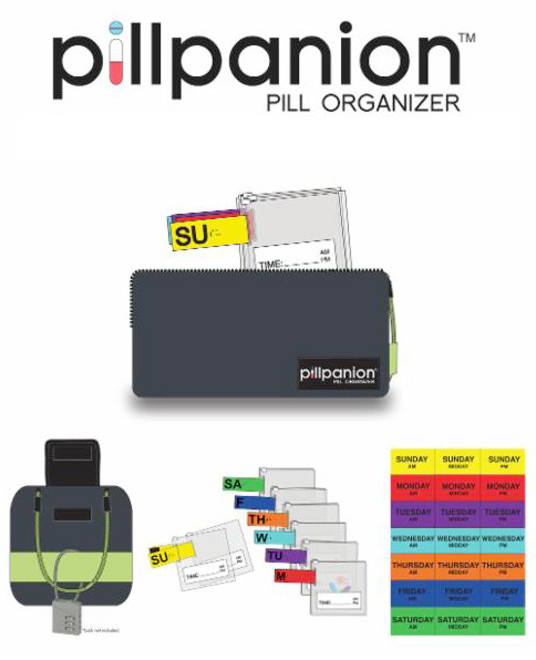
Client: Pillpanion
Role: Art Director
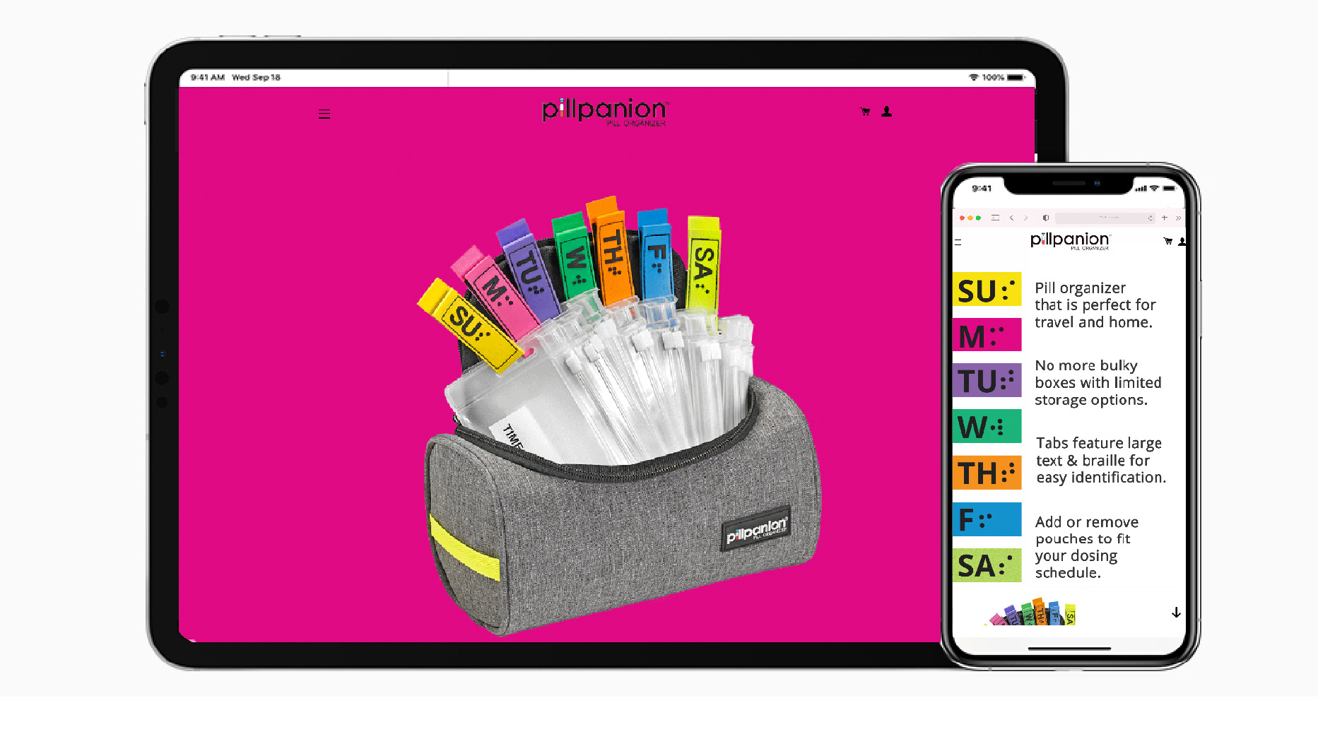
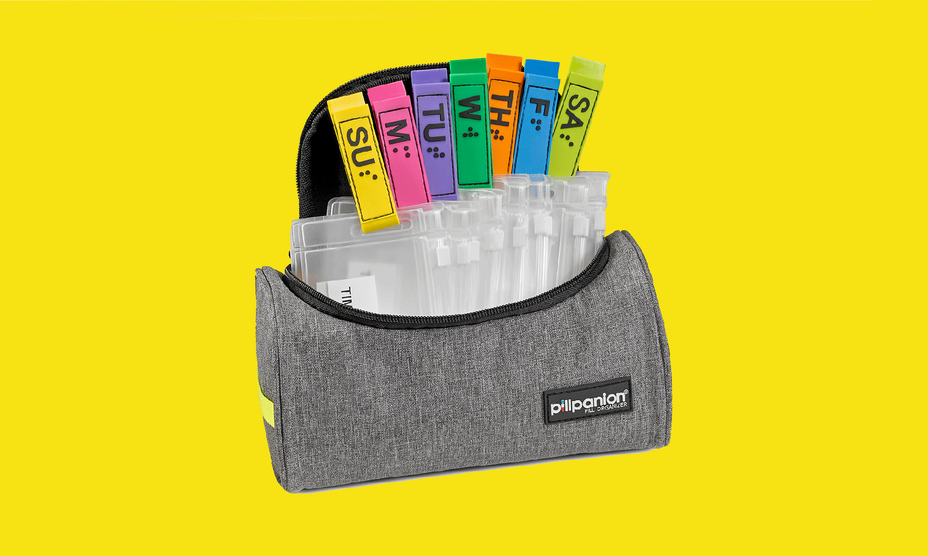
Challenge: Most pill organizers in the market prioritize function over form, often appearing clinical and impersonal. Pillpanion sought to challenge that norm by offering a product that feels vibrant, human, and uplifting, while maintaining accessibility and ease of use. The challenge was to design a product and brand experience that balances aesthetic appeal, usability, and trust for an aging audience.
Creative Strategy: The creative direction centered around the idea of “companionship in care.” Every design decision—from color to typography to product ergonomics—was guided by empathy and optimism.
Core Principles: Empathy & Ease: Prioritize legibility, comfort, and intuitive design for all age groups. Position the brand within the lifestyle wellness space, not just healthcare.
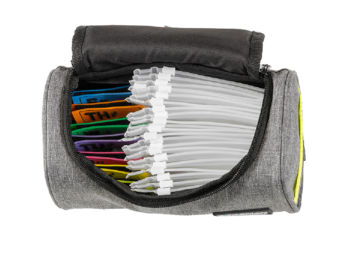
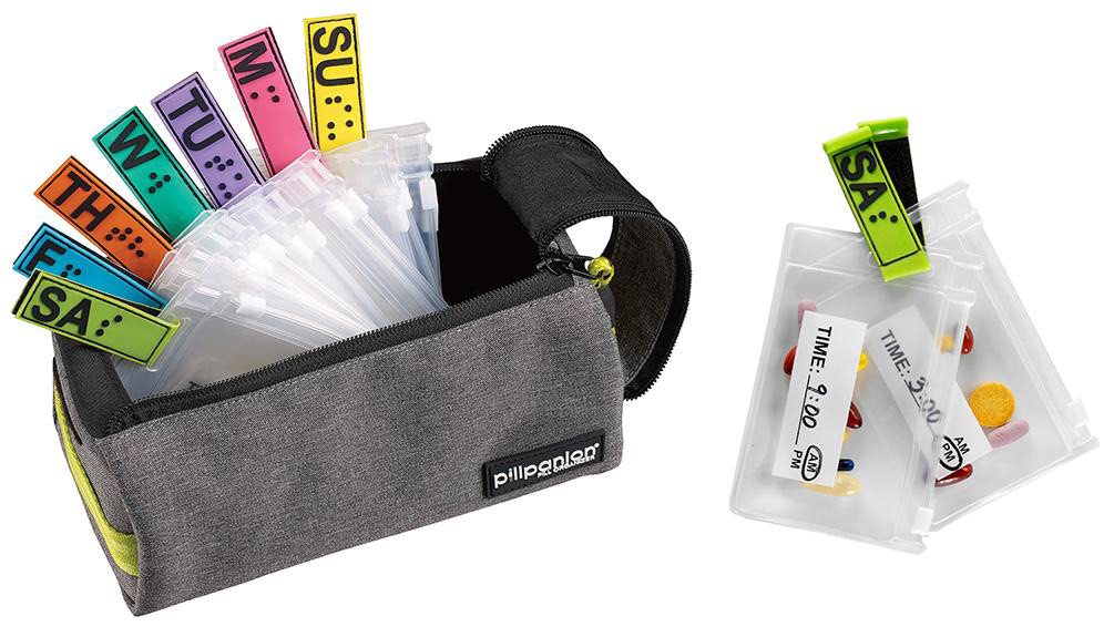
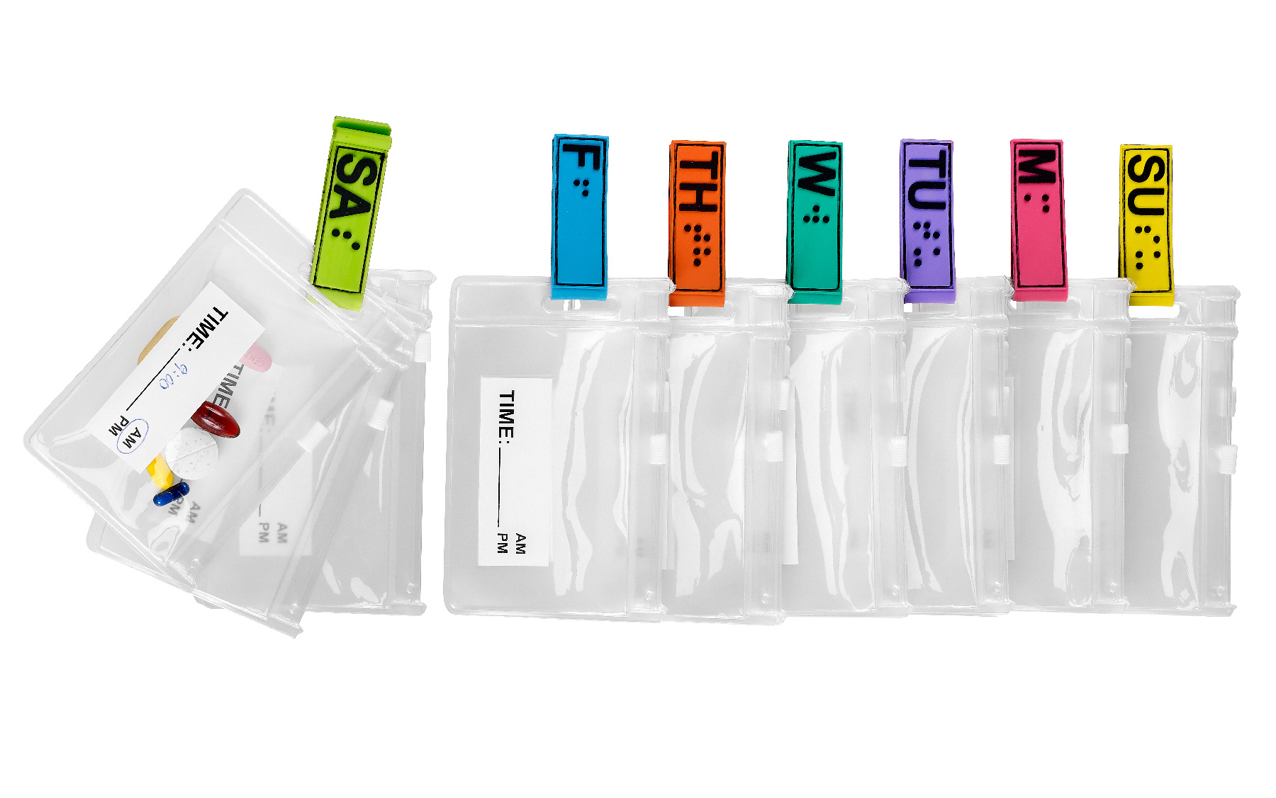
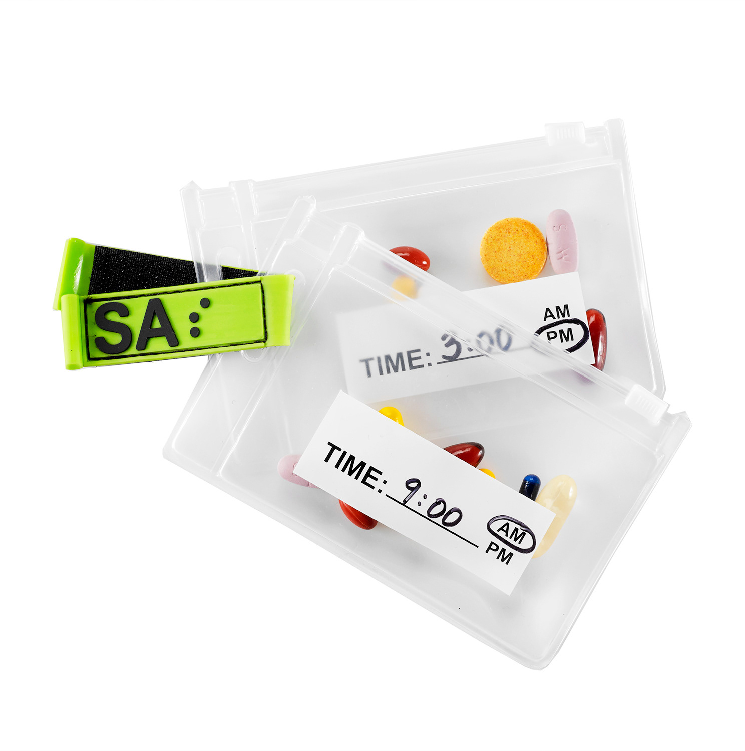
Execution: Product Design & Development: Collaborated on early concept sketches, materials, and compartment layouts. Focused on tactile comfort, lightweight construction, and clear labeling.Integrated modular elements for daily, weekly, and travel needs.
Designed a logo symbolizing care and connectivity—two interlocking forms representing companionship and support. Established brand guidelines covering tone of voice, color use, and packaging.